No oil painting
- Chris Rogers

- Jul 5, 2025
- 5 min read
Updated: Sep 13, 2025
The National Gallery in Trafalgar Square reopened its Sainsbury Wing in May, after two years of building works to brighten and reshape the Post-Modernist extension built a generation ago to designs by Venturi Scott Brown and funding from the arts-loving supermarket family. With the new project proving as controversial as that original scheme and a mixed response from critics the other month, I was keen to assess the results myself when visiting the gallery shortly afterward.
A reminder of the aims, implemented by architect Annabelle Selldorf’s practice: improve the space immediately outside the entrance by cutting away some of the raised, walled lawns fronting the main building and installing benches; lighten the gates, railings and glazing to make them more welcoming; and modify the original lobby by removing and recladding columns, cutting back the first floor to form a mezzanine and making more space overall. Just after planning permission was granted I mused on the drivers for those interventions, whether the approach was likely to succeed and how the adjacent National Portrait Gallery, then part-way through its own project along similar lines, had responded; having now seen the outcome, the lines of caution I sketched then have, sadly, coalesced into something of a mourning portrait.
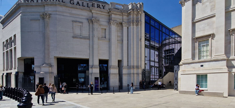
Approaching the gallery it’s doubtful whether many visitors, tourists or passers-by will notice the changes to a small portion of the main Wilkins building even if the move does unbalance its architecture, but nor will they recognise the “new square” within a corner of the wider Square that action was supposed to create. Two long benches, crafted from the stone that was removed, are well used but seem insipid and overall one struggles to see the value.
The rather crass new ‘NATIONAL GALLERY’ signage atop the Wing’s façade, duplicating the existing incised gold lettering on the Wilkins building but with considerably less subtlety, is bizarre and makes me wonder whether I should have submitted the jokey illustration I created for my first post on this subject as a serious proposal.
Closer-to, the gallery’s recessed entrance is still depressingly prefigured by Tensa barriers and barely affected in visibility terms by the once black railings’ lightening (literally and in hue – they have been thinned by one leaf of steel and powder-coated in ‘pewter grey’), so it’s hard to accept that a “more accessible and less formidable entrance”, as the public was promised three years ago, has emerged. Fortunately movement through that space is now less cluttered, with a clear exit-only arrangement into Whitcomb Street or access into the lobby proper.

It is here of course that the main impact of Selldorf’s effort is immediately apparent. Much more horizontal space has been created by removal of the original shop, information desk and cloakroom as well as alterations to those columns. Two retain their deep plan and imitation rusticated ashlar finish, but several more have been stripped back, thinned down to circular form and re-covered with a strange, dark-coloured material that looks – frankly – cheap, and matches neither in colour nor texture the first pair or any other element of the lobby’s palette. It’s a genuinely curious choice, especially given the degree to which materiality was mentioned in the online public briefing I took part in all those years ago, and ironically adds to a new sense of visual confusion in the remade lobby when combined with the very large, airport-style digital wall, inevitable bar and a tiny shop (presumably one of the promised “smaller pop up retail moments”).

The second major Selldorf intervention is the opening of the ceiling in places to bring more light into the lobby and encourage upward movement. Three years ago Selldorf spoke of “creating [a] more open connection for [the] first floor as people realise space is there”. She wanted people to see in from Pall Mall and to appreciate that there is “festive, lived-in space” that can “communicate down to the square”. Has that been achieved? It may be that further visits will soften my initial view but for me the answer is no.

I saw little evidence of connection between these spaces, with most people either sitting or walking as needed and no real sense of them moving organically through a single, flowing volume. Aesthetically the curved edges of the new voids have come in for real criticism, as they employ a language unseen – at least to that extent – elsewhere else in the Wing. I don’t disagree but simply find them awkward, with their execution (complete with curved glass balustrades and sometimes poor joints) clumsy. The material used to finish the exposed floor edges of the voids is, bafflingly, different yet again. Both types of columns, meanwhile, have been carried up to this level.
The remodelled mezzanine is now home to a new dining concession which whilst on the same physical level as the previous incumbent occupies a rather higher price bracket. This is perhaps unsurprising and is no doubt intended to attract custom from Pall Mall, but it feels a little discomfiting when encountered above, literally and metaphorically, an entrance intended to “broaden and diversify” the gallery’s visitor profile. And any patrons who can afford it might find the diffuse layout – a series of banquettes and standalone tables with no surrounding walls or indeed much indication of where to go, that are constantly criss-crossed by busy staff on their way to and from various private areas and another tiny shop – a less than conducive environment in which to enjoy their meal.
So, after few years of work and the expenditure of nearly £100 million, what do we have?
We have a lightly remodelled Sainsbury Wing ground floor whose exterior appears neither substantially or even detectably more welcoming and whose lobby is, yes, much larger but not really any better, unless your idea of better is to emulate an airport departure lounge (emphasis on the ‘lounge’). From said lobby visitors still have to find and then realise the significance of the main stair, which is still pushed to one side of the space and rammed hard up against a glazed wall. The latter is supposedly now more transparent though again that was not, er, clear. Half way up those stairs they will find, yes, a lighter mezzanine but one that has no proper function and no real linkage to the rest of the gallery. The whole is far, far less integrated and effective than Jamie Fobert’s exemplary work at the NPG next door, which was completed far faster and to universal acclaim. And whether even the revised space will cope with the significant increase in traffic that will be occasioned when the second stage of the work – a basement link between the Sainsbury Wing and the Wilkins building, to permit a single, continuous visitor circuit without the need to double back – remains to be seen.
At the National Gallery there is beauty up those stairs, but below we still have only a torn and spattered canvas.


Comments