Concrete decisions. Sometimes.
- Chris Rogers

- Aug 31, 2025
- 6 min read
Updated: May 4
The Barbican is to spend millions improving signage, revealing original features and remodelling its foyers (2025).
The Barbican is to spend millions improving signage, revealing original features and remodelling its foyers (2016).
The Barbican is to spend millions improving signage, revealing original features and remodelling its foyers (2003).
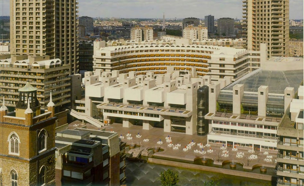
No, these lines are not an installation in the popular City of London arts complex’s gallery, and nor are they the text of a spoken word event in its library. They don’t introduce a film in the cinemas and aren’t part of a performance piece in the theatre either, whilst they are unlikely to be music to the ears of concertgoers in the hall. Or taxpayers in the Square Mile, since they in fact describe not one, not two, but three programmes of upgrade work that have been or are about to be carried out at the Barbican centre – designed by architects Chamberlin, Powell & Bon and opened in 1982 – in less than twenty years, the latest of which went to planning this week
and actually reverses some of the interventions from the last one. Confused? I’m not surprised, and it’s nothing to with the massive Brutalist building’s challenging layout.
Of course that is one legitimate problem that has always needed solving; as with the Southbank centre, its contemporary cousin across the river, the Barbican wraps – one might say hides – some much-loved venues within a ring of concrete walkways, staircases and ramps that many find frustrating. But a third attempt to put that and other perceived flaws right in such a short space of time suggests that many of those past tries were just plain wrong, whilst in a world increasingly concerned with sustainability there is surely a developing argument in favour of simply stopping and accepting the building as it is.
In the meantime, though, the public will once again see substantial changes to the physical fabric of the lakeside, foyer and conservatory areas after the expenditure of another £200 million and the passage of five years, these being the price of delivering a new plan led by Allies and Morrison, Asif Khan Studio and Buro Happold titled simply Barbican Renewal. It will also look to improve catering facilities, toilets and the mechanical, fluid and electrical systems that keep the centre going.
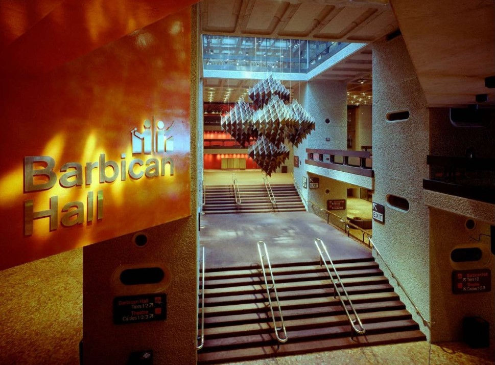
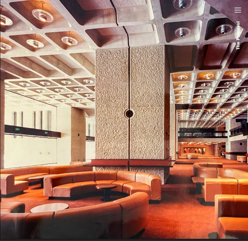
For me the principal concern is the foyer, which is already some aesthetic distance away from the Piranesian views, bespoke Robin Day furniture and vast suspended Michel Santry sculpture that originally characterised this space. Indeed you might be surprised at just how much has been taken away from, put in or modified here over the years, and how quickly some of those alterations were themselves abandoned when the centre’s management subsequently changed its mind. What really grates, beyond the flip-flopping, is how each new justification reads as though no-one knows who made the earlier decisions that are now being criticised. This year’s scheme is sadly no exception, as I think the quotes below – which come from Barbican publications and planning documents except where indicated – show.
So let’s dive in and see how the Barbican management has once again ‘discovered’ another set of flaws and foibles within London’s cultural megastructure that it has no idea who to blame for...
=========================================================================
“Since the Centre opened in 1982, the original architectural vision for the Foyers has been compromised”
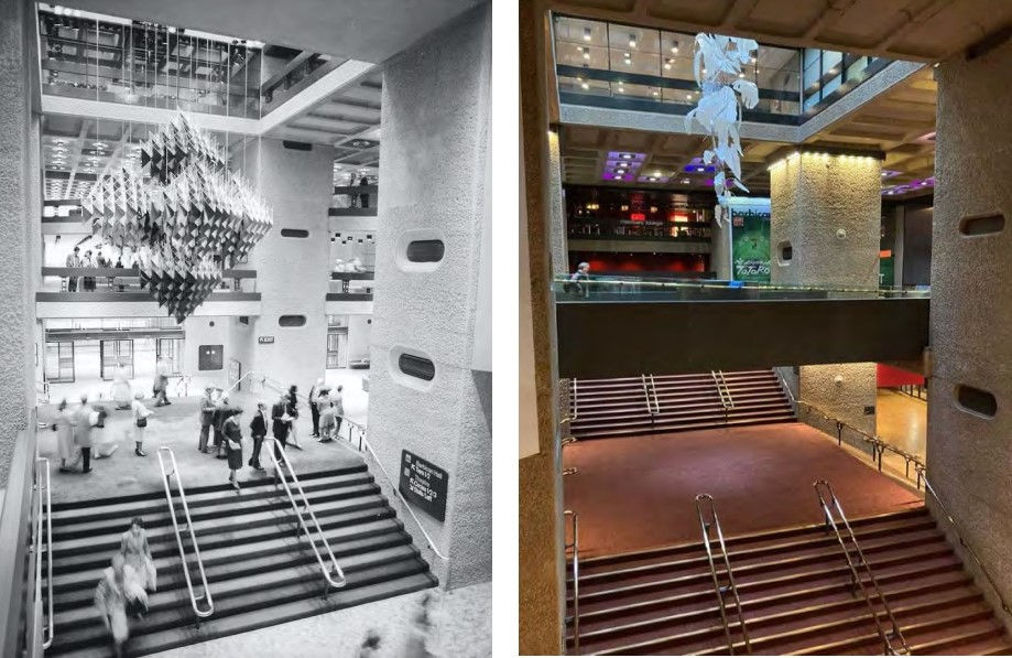
Er, yes, because of repeated chopping and changing in this crucial area – literally. It started in the 1990s, when design consultancy de jour Pentagram added a narrow bridge from the Silk Street entrance across to the Lakeside portion of the lobby. This aided access but blocked views of the theatre and interrupted the dramatic void between the lower ground floor and the coffered skylight three floors above. In 2007 these problems were exacerbated when AHMM removed the Pentagram bridge and replaced it with their own, much wider, version, which was moved away from the theatre back wall but which blocked even more of the void.

That same practice also took out the 40-tonne lower flight of the main stair, filled in part of the floor between the two library levels and did the same between the library and the gallery. Those moves destroyed forever the ‘free flow’ plan at the heart of CP&B’s design, by which curious patrons could wander at will from the foyer, through the library and end up in the art gallery. As CP&B wrote at the time, “the building was intended to foster collaboration between the different arts bodies with their overlapping activities, with an emphasis on visual and physical connections between floors” but now those aims are much harder to appreciate.
The mutilation was explained by the Barbican describing the stair as one “which no one ever used”, a remarkably disingenuous statement given that it had actually prevented people from doing so years before. The act was also irreversible, and if proposed today would flout the centre’s heritage management guidelines (adopted in 2020) which state that with any such removal “the option of future reinstatement, even on a temporary event basis, should be retained.”
=========================================================================
“People have always found the Centre hard to navigate, and layers of wayfinding can be confusing and inconsistent”
This is of course true, but that is why the orange Cartlidge Levene and Studio Myerscough signage was installed in 2007, part of a scheme that was budgeted at more than £12 million and won awards. Described at the time as bringing “clarity and cohesion to this once unnavigable space”, it featured “supergraphic arrows at key decision points” meant to “direct flow” in a way that “respects the original architecture.”
Personally I was never convinced about either of those claims, and people are indeed still getting lost. Barbican Renewal doesn’t mention this at all, so perhaps it’s worth reconsidering Ken Briggs & Associates’ original scheme in all its 1970s glory, hardly any of which survives of course after numerous attempts to address the issue.
=========================================================================
“Largely unlit entrance areas [feature] a double layer of narrow doors. This reduces transparency and compromises visitor flow”
Perhaps, but extra doors were only put in as part of that same 2007 scheme. They aimed to “provide an acoustic buffer between the foyers and the Lakeside” but this is now seemingly deemed less of an issue than visibility and permeability. They will be therefore be removed this time round, wasting a fair bit of hardware in the process. You might think the lighting, at least, would have survived intact from 1982 but you’d be wrong – three different types of fitting have been tried in the coffers alone including the originals.
=========================================================================
“Visitors find the entrance from Silk Street confusing and the addition of the shop to this space has blocked key views across the space”
Ah, that’ll be the shop that was installed less than eight years ago (Christmas 2016), when AHMM (them again) described it as occupying “a prominent position, retaining, re-using and extending the super-scaled portal from [an] earlier project”. That earlier project was the advance box office, which had itself only been inserted in the 2007 scheme; I hope you’re keeping up.
=========================================================================
“Furniture is generic, inflexible and does not suit a range of needs. It is inconsistent with the design identity of the space [that] limits comfort”
That original suite of furniture – the squishy, snaking Robin Day ‘Hadrian’ range – was purpose-designed for the Barbican and picks up the semi-circular motif deployed by CP&B all over the estate in a range of sizes and materials. Of course the centre got rid of it decades ago, leaving the foyer today looking like a rather cheap DIY store display.
I’m being a little harsh. A great deal of attention is being paid to the building’s architectural heritage and the need to observe and recover it – we are told that “the proposals re-focus on the materiality and grandeur of the foyers, bringing back the textural warmth and functionality of the original vision” and there are hints that one will be able, once again, to go out on the balconies that overlook the lake. They are filling in the pointless hole in AHMM’s bridge. And models have been used to develop the scheme, a nice throw-back to CP&B’s day.
Whether someone will agree that this should be the last time the Barbican centre is touched remains to be seen. For now, you can remind yourself of the epic grandeur and ambition not just of the arts entre but the wider estate either physically, via an original large-scale model that is on display outside the lower level of the shop, or digitally, thanks to the fun Google arts and culture project some of my earlier links sit within, whose title and rather labyrinthine navigation are surely witty nods to their subject.
I hope the new reality will live up to both virtual images. Because despite its Grade II listing, only one word seems adequate to describe the treatment of the Barbican’s architecture over the past few years at the hands of those trusted to look after it.
Brutal.


Comments